
Material Editing Imporvements
In the last couple of weeks and months, we put some more work into the material editing UI, to make it easier to use and use less space on the screen.
This is a little preview of what is to come in the next release, Indigo 3.2, and still a work in progress, so if you have any wishes and suggestions, please feel free to tell us about them. There is a discussion thread on the forum for it especially. You can find it here.
First, let us have a look at the old interface:
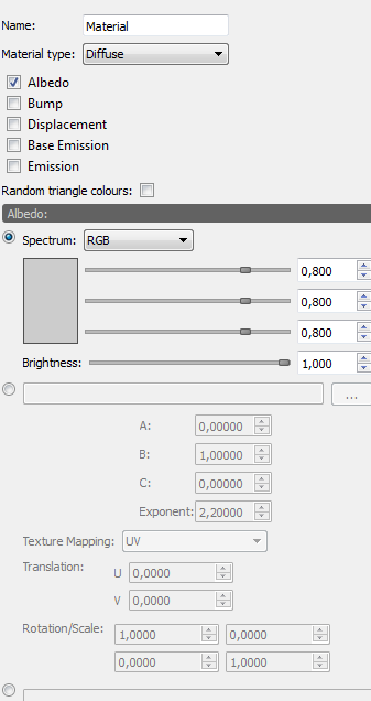
There are a couple of things wrong with it:
- It does not even fit on the screen of a laptop
- Only one channel is visible at a time, making it impossible to get a quick overview of how a material is set up
- Every option, even if unused, is shown
Pretty bad, isn't it?
Here is what it looks like now:
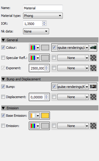
Now, all the channels are visible and you can get a quick overview of the materials setup, e.g. which channels are used, what kind of settings are used.
The icons used for the spectrum type are not final yet.
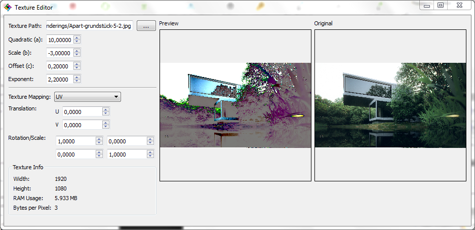
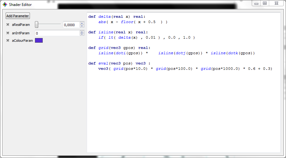
The shader and texture editing has been moved to sperate windows, of which you can have as many open as you want:
Please let us know what you think and tell us how we could improve it even further in the discussion on the forum: http://www.indigorenderer.com/forum/viewtopic.php?f=7&t=11178