Page 2 of 2
Posted: Thu Jul 03, 2008 7:31 am
by Kram1032
white is inefficient.
Paper has a reflectivitiy of 85% max for example. Usually, white walls are between 70 and if they're very bright, 80...
So, don't go for 1 1 1 white but for, say, 0.75 0.75 0.75 grey, which will appear to be white

Or use a slight tough of colour... For example "Cosmic latte" (a bit darkened so that the contrast is high enough: )
Here, you have some alternatives for white:
http://en.wikipedia.org/wiki/Category:Shades_of_white
divide the R, G and B component by ~300 so that you get propper Values, already toned down a bit (to ~85%)
If you want to go for the full luminosity, which will eat contrast and increase render-times, you also can divide by 100 for the full brightness.
Posted: Thu Jul 03, 2008 8:46 am
by Woodie
Nice render, but for future try to use adjusted version. Jpeg in say 800x600? Even at my very fast connection it took like 30sec to load the images. Png is very good for rendering results but not so much for internet. Some people with slower connection will just give up.
Posted: Fri Jul 04, 2008 12:49 pm
by neo0.
Modified the lighting.
Posted: Fri Jul 04, 2008 1:33 pm
by doublez
It looks much better now.
Posted: Fri Jul 04, 2008 1:36 pm
by Borgleader
doublez wrote:It looks much better now.
aye, but the whole at the bottom of the sink is still too big. like 3 times too big...ok maybe 2 times too big

Posted: Fri Jul 04, 2008 1:59 pm
by StompinTom
id really suggest changing the point of view. right now theres nothing that nails down the viewers attention composition-wise. perhaps go higher up to get an extreme "fly's eye" viewpoint or lower to get a more human viewpoint. also, try to establish at least a couple strong focal points.
the lighting is pretty basic too, that kitchen looks pretty dreary right now!
try ditching the window and putting in wall sconces or ceiling lighting or something like that. check out
http://www.thelightingcenter.com/images ... ons/86.gif
http://www.mondiale.co.uk/mondoarc/arcpics/lda2.GIF
http://www.dunwoody.edu/content/Image/i ... lhauer.jpg
http://www.aquallusion.com/Aquallusion/ ... oomNew.jpg
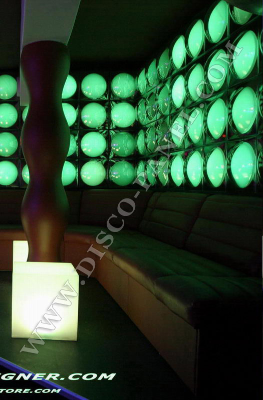
http://www.disco-designer.com/images/FR ... G_1590.jpg
for ideas. since it is an image (and CG rendering is essentially all about light interacting with physical materials) lighting is crucial, so make the most of Indigo and throw in somethin wild!
lookin good so far, keep it up.
Posted: Fri Jul 04, 2008 2:16 pm
by doublez
Borgleader wrote:doublez wrote:It looks much better now.
aye, but the whole at the bottom of the sink is still too big. like 3 times too big...ok maybe 2 times too big
Atleast we can make out the different objects and the architecture now

I also agree with stompintom. A new camera angle would be good. Right now it seems focused on the sink and the camera is looking down. Try rotaing the camera up and at lower it down.
Posted: Fri Jul 04, 2008 2:19 pm
by Borgleader
Yes yes that's a great improvement. But I'm reminding him, because well to me it Just stands out way too much. And it's an easy fix too.